This web site is a resource for railway modelers wanting information about the liveries used on British railway buildings. I am a professional architectural model maker specializing in railway buildings, so I am probably in a better position than most people to collate this information and make it available to fellow modelers интересная прогулка на теплоходе по Москве.
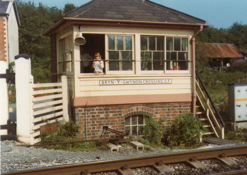
Genuine GWR light and dark stone paintwork on Bryn Y Gwynon signal box. Many thanks to Joe Cussen for the photo.
VISITORS TO THIS WEBSITE

I have split the site into pages covering the four grouping companies, which include the pre grouping constituents and the appropriate BR regional livery, and Scotland which seemed to be best served by a page of its own. A further page gives color patches and drawings of the poster boards used by the companies, and finally, the links page allows users to contact the many specialist societies dedicated to individual companies.
The information has been collected over many years; to the best of my knowledge it is correct, but if you know differently please let me know so that the site can be updated equally, if you have any questions please feel free to email me.

PAINTING RAILWAY BUILDINGS
In the Victorian period when a building was painted the painter had a bucket, some white lead mixed with linseed oil & turpentine & some pigment which he added to the white on site before he began work. Naturally, he didn’t always get the mix exactly the same, so colors varied; shades of buff were common, as were creams which used less pigment with the white. These were often set off by shades of brown; these were the cheapest and longest lasting colors so the railway companies, always watching the pennies, used them widely.
Colors such as ‘stone’ & ‘buff’ were made by adding iron oxide to white lead and mixing with linseed oil and were by far the commonest for large areas such as planking other than in Scotland where darker colors were preferred. Increasing the amount of iron oxide gave a darker shade, and darker colors such as brown used red lead as a base which gave depth to the color but which was just as toxic to the poor painter.
The colors dried with a gloss finish but this soon faded to matt and altered hue in the rain as well as fading with age and becoming dirty. There was no such thing as ‘Brilliant White’ in those days, and the white that was available had a Linseed Oil base which meant that it is quickly yellowed. It is never a good idea to be dogmatic about shades of color, especially when they are now beyond living memory.
However it should be noted that the GWR was using ready-mixed paints in tins by at least 1907 which ensured consistency of colors and was safer for the painters, and it is likely that other companies made the move to liquid paints a lot earlier than had previously been thought.
It is important to remember that in Victorian days the number of pigments available was quite limited, and those available at a reasonable price were even more limited, so it is not surprising that some early station color schemes look rather drab to modern eyes. Reds, in particular, were translucent and the color of the undercoat had an important influence on the top color; the NSR and the FR used similar Madder Lake topcoats, but the grey & red oxide undercoats made the finished paintwork look very different.
In fact, the Victorian paint served its purpose very well; it was hard-wearing, colorfast and unlike modern oil-based paints did not tend to crack & peel away from the surface underneath. Unfortunately, because of the lead, it was also very poisonous. The main danger to the painter was not from the application of the paint, but in rubbing down the previous coats and inhaling the dust and then doing the same when mixing the paint from powdered ingredients. The lead was an important part of the paint; it speeded drying, made the paint durable, resisted fading and helped keep out moisture; there was no alternative to using lead until after World War Two.
In 1926 the Lead Paint Act came into force which is when work began in earnest to find replacements for the lead in paint, but it was a slow process. At the same time, ready mixed paints in brighter shades were becoming more readily available at an affordable price, allowing the Southern, for instance, to use a bright chrome green on stations, though these paints were still lead-based, to begin with.
Building interiors used a paint called ‘Distemper’ on plastered walls, which was made from powdered chalk, glue size and pigment and could be had in a wide range of colors. It was not terribly durable, but painted onto plaster it allowed moisture to pass through allowing the plaster surface to breathe. A pale green or a light stone color was a popular choice for stations regardless of the color of the external paintwork; in the days of gas lighting having light-colored internal walls was important, and for the same reason ceilings were usually white. Where internal walls were planked or paneled in wood, and for doors, etc. the same paint was used as for the exterior of the building.
I have made no attempt to take the story beyond the steam era, as I am not knowledgeable about the ‘Modern Image’ period.


A NOTE ON POSTCARDS
I have used a number of original colored postcards from my collection to illustrate this web site. These were produced by hand coloring a black & white photograph, and it is quite possible that the artist had no idea what color the station should have been, so simply did what he or she thought looked nice! However, in many cases, they are all we have in terms of contemporary colored illustrations, and to my mind, something is a lot better than nothing; where livery information is known, in many cases the cards match that information very closely. As long as they are used with caution, I feel that they are well worth including on the site, and I have only included cards which seem to me to offer an accurate portrayal of the scene.