Thanks to Ivan Godfrey and to Tony Wood of the HMRS for help with this section, and to Michael Dunn of Kidderminster Railway Museum for his help and in particular for providing me with the official painting specifications.
The GWR building livery remained largely unchanged from deep in Victorian times when the first written references are to be found, to the end of the grouping period except that a color officially called ‘chocolate’ was widely used in the 19th century https://experience.tripster.ru/tours/uzbekistan/ but fell out of use after 1900 and at around the same time Stone no.2 ceased to be used following the introduction of ready-mixed paints (see below).
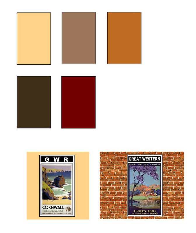
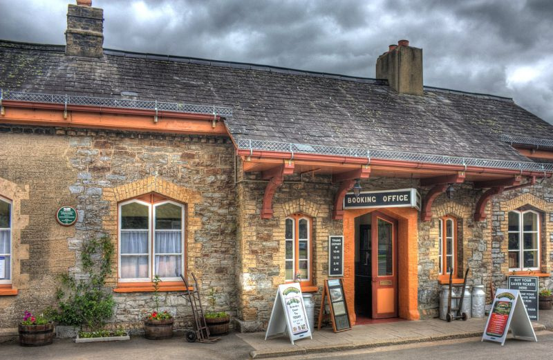
The three basic colors were ‘Stone No. 1’, or light stone, Stone number 2 and ‘Stone No. 3’, or dark stone. Stone No. 1 was a warm buff color said to have been a copy of Cotswold stone. The stone no. 2 was a darker, browner buff while the dark stone was a mid-brown with a reddish tint, again a warm color. Stone 1 or stone 2 could be used for large areas like planking and canopies, with the darker Stone No. 3 for doors, metalwork and the like. According to ‘Great Western Way’, if Stone 1 was used for the topcoat, Stone 2 was used as the undercoat and vice versa, so that the other color showed through when the paint was worn as an indication that repainting was due.
All three shades were made by mixing iron oxide (ochre) with white lead mixed with linseed oil; the greater the amount of iron oxide, the darker the shade. Great Western Way suggests that Stone no. 2 was the most widely used until the 1900s but gives no evidence for that statement, and it should be noted that the official specification for signal boxes dated 1907 and reproduced below makes no mention whatsoever of Stone no. 2. The other official shade was ‘chocolate’, a warm rich maroon/brown with a reddish tint and this was used more than Stone no. 3 on signal boxes up to around 1907 and the same may have applied to stations before that time.
By 1907 and possibly before the GWR was buying ready-mixed paints in tins; one supplier was Williamson’s Ltd and their records make no mention of Stone no. 2 which suggests that from that time on only Stone no. 1 and Stone no.3 were used certainly all the color pictures I have seen from the 1930s, 40’s and 50’s show a light shade for planking, etc. which indicates Stone no. 1.
Presumably, the GWR decided when they moved to ready-mixed paints that there was no point using three or four shades when two would do the same job perfectly well so the chance was taken to simplify things. A second supplier was the Torbay Paint co. who supplied paint under the ‘Ripolin’ trade name which is referred to specifically in the 1907 specification. This company advertised in the GWR Magazine in the pre-1914 period.
To put it simply, in the 19th century three shades of stone were in use together with chocolate brown, and in the 20th century only Stone no. 1 and Stone no. 3 were widely used which simplifies matters considerably for modelers. In both periods window frames and glazing bars were always white.
The Lead Paint Act was introduced in 1926 after which lead-free paints began to be manufactured which again might have had slightly different tones and would certainly have weathered differently from the lead-based paints. In 1931 the next change was made to the livery when a maroon was introduced for guttering, downpipes and hardwearing areas like steps on footbridges. Everything else remained as it had always been; I do wonder if they had a lot of ‘Coach Lake’ left at Swindon works, and had to find some use for it!
Window frames & glazing bars were still painted white. Some wooden buildings were painted with the lower walls in chocolate brown in later years, which should be obvious from a B&W photograph this seems to have been the only use made of the chocolate color during this period.
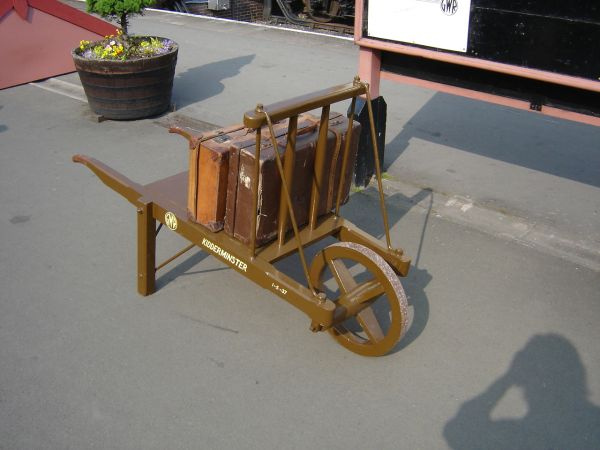
GWR poster boards were black with the beading painted in white, as was the lettering; station signs were the same, and cast iron notices were also black & white. Enamelled notices were dark blue with white lettering. Platform barrows were a ‘milk chocolate’ brown with black wheels & lettering in straw/cream the restored examples on the SVR are a good reference. The brown seems to have been a shade used only for barrows; it was lighter than coach brown and totally unlike Stone No. 3. see the photo below. Fencing was painted in either Stone No. 1 or No. 2 to match the station building, but gates could be white to make them stand out, something which should be clear from photographs.
In a few places such as Hungerford, early enameled signs survived over doors or as running in boards; these had dark blue lettering on a white background or could be white on blue. Some wooden goods sheds were not painted but the wood was finished with a preservative such as creosote which gave a black shade when newly applied which weathered to a mid-grey over time. Doors & windows etc. were still painted in the usual way – B&W photo’s make it easy to identify sheds finished like this.
Signal box name boards were black & white after 1898, Stone no. 3 with chocolate lettering before then though in the early days this was done with separate cast iron letters screwed to the
planking as in the photo below of Frome Mineral Junction box, restored at Didcot. The cast-iron name boards came into use in January 1891 though initially, their use was not widespread. By the mid-1890s pretty much every signal box had been fitted with the new name boards and it must quickly have become clear that the old color scheme was not satisfactory for the smaller lettering on the new name boards resulting in the new regulations issued in 1898.
Interior walls of brick or stone buildings were plastered and painted with distemper, which was supplied in white, cream, brown, Ivy Green, Dark Green and Cambridge blue. One of the darker shades was used up to nano level, with a lighter shade above.
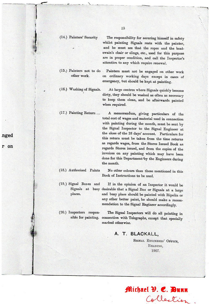
Wooden buildings were painted internally in the same colors as were used on the outside. Interior walls of loco sheds, goods sheds, and sometimes wooden trainsheds were also painted white which should be clear from photographs. Kingswear train shed was an example of this, another station that was never repainted into BR colors.
The list of official GWR paints for buildings was:
- Stone color
- Stone color
- Stone color
- Chocolate brown
- Bridge green
- Steel grey
- Signal red
As far as modelers are concerned, stick to the paints I have listed below and you’ll be fine. There are a number of published color photo’s of stations in GWR paintwork; Barbers Bridge station on the cover of GWR Country Stations Vol 2, Fairford on the cover of GWR branch line modeling Vol 1, and the color pictures in ‘The Big Four in Colour’…..the book by Lightmoor Press on the Newent branch is full of useful color pictures. Late surviving stations in GWR paintwork were the stations on the Chard branch, the Fairford branch, and the Newent line, none of which were repainted by BR.
PAINTS FOR MODELLERS
Precision P21 GWR Light Stone No.1 & P22 GWR Dark Stone No.3.
For the maroon I use Precision GWR Coach Lake, and for chocolate brown Precision GWR coach brown or Tamiya flat brown mixed with maroon.
PAINTS FOR PROTOTYPE RESTORATIONS
Dulux 2030Y40R GWR light stone Dulux 4030Y70R GWR dark stone Dulux 7020Y90R GWR brown (benches, barrows, etc).
BEST PLACE TO SEE IT
Didcot Railway Centre, Severn Valley Railway, South Devon Railway, Kidderminster Railway Museum.
TO BE AVOIDED: Paignton & Dartmouth Ry, Dean Forest Railway.
OFFICIAL G.W.R. PAINTING SPECIFICATIONS
The above is a brief overview – reproduced at the bottom of this page are official written specifications issued by the signaling department at Reading in 1894 and 1907 for the painting of signal boxes, signals, etc. The scheme for stations and other buildings followed the same practice very closely and the colors, of course, were exactly the same.

Here’s that photo of Bryn Y Gwynon signal box (near Bridgend) from the home page; this is what GWR buildings looked like! It has a replacement name board
as it has been downgraded to a ground frame, but other than that the livery is GWR. The colors are a bit faded, partly due to the bright
sunshine, but this is how a GWR building was painted.
Below are the two signal boxes at Didcot; other than the newer paintwork they look just the same.


HAMPTON LOADE ON THE S.V.R, BEAUTIFULLY RESTORED TO VICTORIAN CONDITION WITH THE DOOR IN CHOCOLATE WITH PANELS IN STONE No. 1.
THE PAINT ON HIGHLY SIGNAL BOX IS SLIGHTLY FADED AND WEATHERED, JUST THE FINISH MODELLERS SHOULD AIM FOR…IT IS DEAD FLAT, THERE IS NO HINT OF SHINE IN THE PAINTWORK..
CHINNOR STATION IS A BEAUTIFUL RECREATION OF THE ORIGINAL, WITH THE PLANKING IN THE DARKER STONE No. 2. A RESTORED PLATFORM BARROW ON THE S.V.R.

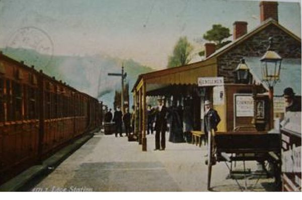
LOOE STATION WITH A GOOD RENDERING OF THE GWR COLOURS.
CAMBRIAN RAILWAYS
The Cambrian inherited a cream & brown scheme from the Mid Wales railway, but by the beginning of the 20th century had settled on an attractive livery of very pale cream & green, with the green as usual for the doors, metalwork, etc. The nearest match to the green is that once used by British Road Services.
The cream has also been described as white, so either a white paint had yellowed to cream due to the varnish, or the cream paint used was so pale as to weather to white….probably the former. A lighter shade of green was used on occasion alongside the darker shade, for instance on the balancing at Barmouth East signal box where it was used alternately with the white/cream.
Unfortunately, the company had a reputation for leaving its stations in a deplorable state, probably due to a perpetual lack of funds, and in 1914 much of the painting work was put out to contractors. No official specifications have been discovered, and there seems to have been a lot of local variation – happily, a black and white photo will distinguish between areas painted in the two colors. Running in boards and signs on stations seem to have used the same two colors, though some enameled signs had white lettering on a blue background. Fencing could be painted in either green or cream/white.
Poster boards were all over green with ‘CAMBRIAN’ in white on the top panel.
Many thanks to Mike Morley for help with this section.
PAINTS FOR MODELLERS
Cream – Precision SR buildings cream (but see above regarding white color).
Green (darker shade) – Precision British Road Services green.


This should give a pretty good match for the darker green used on Cambrian buildings.
TAFF VALE RAILWAY
The Taff Vale used a very yellow looking buff for the majority of the paintwork on buildings, with ironwork on canopies painted white and the lower sections of canopy columns in black, probably a protective measure. Doors on stations were varnished oak, so a dark brown on a model would be appropriate. In 1914, the footbridges at Llandaff and Llwynypia were painted in reddish-brown, but where this was the generally used color is not known.
Poster boards appear to have been black with white lettering.
PAINTS FOR MODELLERS
Buff – I would use GWR light stone with added yellow.

BRECON & MERTHYR RAILWAY
The B&M used a color described as ‘Salmon Brown’ for the bulk of the woodwork on buildings, with framing painted black and white window frames. Salmon Brown does not appear from black & white photo’s to have been a dark color, and SR Light Stone would seem to be a good approximation. Running inboards were salmon brown with black lettering.
Notices, including signal box name boards, were enameled, with white lettering on a dark blue background.
PAINTS FOR MODELLERS
Salmon Brown – Precision SR buildings light stone.
NEATH & BRECON RAILWAY
It is known that running in boards were enameled with white lettering on a blue background. The paintwork on buildings was reputed ‘stone and brown’, another case of using the cheapest pigments! Window frames were white, except on signal boxes where below floor level they were red/brown.
BARRY RAILWAY
Most of the woodwork and metalwork was painted brick red, with window frames in white (HMRS Journal April 1981).
Station running in boards and signs were enameled, with white lettering on a dark blue background. Thanks to Meic Batten for the information.
OTHER WELSH RAILWAYS
Nothing seems to have been recorded about color schemes on any of the other Welsh lines – unless you know differently, of course.
MIDLAND & SOUTH WESTERN JUNCTION RAILWAY
It seems appropriate to include the M&SWJ here as the GWR took it over, though the directors might have preferred it elsewhere!
Buildings were painted in buff & brown in the usual way, often with the canopy valencing picked out in alternate stripes. In later years they brown was used more extensively, which should be apparent from a B&W photograph.
Poster boards seem to have been brown, lettered in cream or buff. Where running in boards and other signs were enameled metal, the lettering was white on an Ultramarine blue background.
PAINTS FOR THE MODELLER
I would use Precision GWR light stone & LMS buildings brown.

SEVERN & WYE RAILWAY
All the buildings on the line were wooden; the planking was painted cream with the framing, doors, etc. in mid brown. Station interiors are known to have been painted in a pink shade, presumably not too bright a pink! The Severn Bridge was painted in Chocolate Brown for the piers and Cream for the girders, and this probably indicates that structures on the S&W were painted in these colors the picture below shows the bridge and the station to be in the same colors. The postcard below shows the girders of Lydbrook Viaduct to have been red oxide.
Station name boards were cream with the name painted in black, shaded in red to the right & below. Poster boards were brown all over.
The Dean Forest railway have painted their buildings in what they claim is S&W livery, but I cannot agree; the greyish color they have used for the walls is far too dark to my eye when compared with black & white photographs.
PAINTS FOR THE MODELLER
Cream- Precision SR buildings cream.
Brown – Precision LMS buildings brown.


BISHOP’S CASTLE RAILWAY
Not a GWR line, I know, but it did join the GWR at Craven Arms so it seems sensible to include it here.
The BCR station at Bishop’s Castle was recorded in 1955 as being white & red oxide; it is thought that the white was actually a very faded cream and that the actual scheme was pale cream & red oxide with white window frames. Fencing was cream.
BRITISH RAILWAYS WESTERN REGION
The standard painting scheme for the Western Region of BR was the standard cream with a mid to dark brown for the doors, ironwork, etc. Unlike other regions, this livery spread quickly so that few stations survived in GWR colors beyond the mid-1950s. BS381C color references are shade 369 Biscuit and 414 Golden Brown; follow the links on the ‘Colours’ page for BS color patches.
Poster boards were brown, lettered in cream unlike the white of other regions, and station signs followed this pattern, including the enameled metal ones.
Photographs show that the colors could vary quite a lot, especially the cream, which could be a rich Cornish ice cream color on one station, and very pale on another. Are we back to the man mixing his paint by eye on site, even at this late date? The paint was very matt in finish indeed but seemed to wear well.
The GWR was actually in the process of introducing a similar livery in 1947 to replace the light & dark stone, though of course this never got far before Nationalisation, so perhaps the BR scheme was just a continuation of what the GW intended to do anyway.
PAINTS FOR THE MODELLER
Cream – Precision SR buildings cream. Brown – Tamiya flat brown.
BEST PLACE TO SEE IT
Llangollen Railway, Bodmin & Wadebridge Railway.


*********************
Below are official GWR painting specifications issued in 1894 and 1907 with a letter dated 1898 referring to signal box nameboards. Many thanks to Michael Dunn for sending me these and for allowing me to reproduce them. Some pages of the 1907 spec. referring to signals have been left out for reasons of space…anyone wanting copies of these can e-mail me.


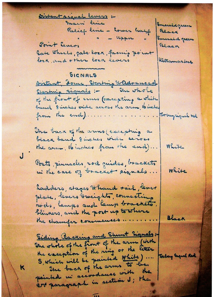


The 1894 specification below is pretty detailed, but unhelpfully it refers to ‘Stone Colour’ without specifying which Stone it means! As ‘Light Stone’ is mentioned later, I would think ‘Stone Colour’ means Stone no. 3 to give a contrast.
************************************************************************